Some of the links in this post are affiliate links. This means if you click on the link and purchase the item, BSB Media will receive an affiliate commission at no extra cost to you. All content is curated by editors of BSB Media..

BSB Media Holiday Favorites in Beaufort, SC
BSB Media Gullah Sea Island Christmas Favorites

2017 Kitchen & Bathroom Trends from Kohler

2017 Kitchen & Bathroom Trends from Kohler


   Are you a Black Southern Belle looking to take on a bathroom or kitchen renovation? Taking the next step has just become easier because homeowners can now work with a Kohler designer to visualize and create a dream bathroom. Learn more here about Kohler’s Bathroom Design Service and to how to work directly with a Kohler designer. All of them are trained in the National Kitchen & Bath Association bathroom standards and are up-to-date on the latest bathroom design trends.

Before embarking on a kitchen or bathroom remodel, homeowners can determine their style preferences with the help of Kohler, either visiting Kohler online or at a Kohler showroom. This resource can help you get your home prepped as the perfect vacation rental or an oasis for your guests. It is also a great project for newlyweds to do together. Share images of your bathroom renovations by using the hashtag #blacksouthernbelle!

Advertisement

To get you started here, are a few of our favorite tips from Kohler.

All in the Mix
Pattern has always had a place in the home, but a willingness to mix it up and to play with scale in surprising ways is a new twist on a familiar theme. When designing this playful, blue-green kitchen, it’s the pattern play that really steals the show. In the mix is a feather-motif ceiling, a mosaic backsplash peppered with jewel-toned drops, and a quilted, blue-green banquette.
What makes it all work together? The color of the counter top, a rich, taupe-brown with copper flecks, because it is not the loudest piece in the kitchen, it brings it together in a harmonious way.
blue and white kitchen decor from Kohler.
           Pattern play can work in even smaller spaces like bathrooms, too. In this master bath that looks truly handcrafted, the mix is bold in scale. Large floor tiles are juxtaposed with oversized botanicals, and are grounded with a calming, soft blue and cream palette on the walls.


Classy gold and black design flows into bathroom.
Perfect Pairs
Velvety blues and vivid greens are gaining ground in bathrooms and kitchens today. Pair them with a complementary color and that’s when the real drama happens. So what are some dynamic duos in play today? In a master bath pictured below, the color pairing of marine blue and blood orange is both of-the-moment and classic all at once. Blues are timeless. The vibe becomes infectious with the addition of blood orange—but in small doses. Highlighting traditional details of the architecture with a line, the color draws attention to the room’s tug of war between different design elements.
Patriotic red, white, and blue bathroom decor from Kohler.
           For another striking color play, a pairing of jewel-toned emerald and rich black brings a bit of mystery to what can sometimes be a utilitarian space. In this galley kitchen, a dark accent wall gives depth and dimension to mirroring spans of luscious emerald green cabinets, creating a luxe, moody atmosphere. It’s a bold statement indeed, but the kitchen is sometimes just where a little drama is needed.
This cal, kitchen is decorated in white and sea green.
A Softer White
Never forget: you can’t go wrong with a white kitchen or bath. Trends come and go, but white kitchens are overwhelmingly the most popular. They feel clean and bright. Since it is typically the first place homeowners go in the morning, white makes a lot of sense.
Nevertheless, a white room can look clinical—fast—so the challenge is to keep it crisp and clean but still make it an inviting space. One way to soften the look of a white kitchen is with warm tones like brass, gold, or bronze. In this classic galley kitchen, the scheme gives it a modern edge by using counter tops with subtle flecks of gold and brass fixtures instead of nickel or chrome.
All white and gold trimmed kitchen decor.
          Brass and bronze elements brings out those little flecks of gold and reflect a little bit of light and create a warm ambiance without you really knowing it.

Another room where you start your day? The bathroom, of course! This elegant white bath is energized with a modern mix of metals—a bold brass chandelier paired with titanium bath fixtures. Warm wood floors ground the room and soften the look of the all-white space. It’s just enough “clean and bright” for a morning pick-me-up, without jolting you into the day.

neutral white and gold design for classy bathroom.
Keep It in Neutral
If you’re looking for a way to introduce color but aren’t ready to go canary yellow, neutral shades work beautifully in both kitchens and baths. And today’s neutrals play in a more unusual palette than you might expect—think pale icy blue and blush sand and more refreshing straight-from-nature shades than your standard beige. They’re perfect for small rooms. Just because a space is smaller, does not mean you have to use color less, you just have to use it wisely.
These more transparent pales diffuse light beautifully and lend themselves particularly well to elements of contrast. In this tiny house kitchen, a matte black faucet and an olive counter top pop against icy blue cabinets.
This kitchen feels like nature with natural wood grain and white.
           In a small powder room on Park Avenue, however, a translucent glass sink in dusky gold and a tobacco tile border make a bold statement against a pale pink backdrop. Neutral and natural don’t have to mean soft.
This bathroom looks luxurious painted in amber and white.
Amber Glow
Let’s face it—the living room has expanded. With comfortable banquettes in the kitchen and easy chairs in the bathroom, we are “living” in every room today, so the more alluring the better. A cozy sultry palette is just the ticket, adding rich ambers and a range of metallics to the smoky grays that have been making their way into the kitchen and bath.
In this kitchen vignette, to feel like a space in a little flat in Paris, the kitchen is designed more as a hangout, and less of a kitchen. Antique brass upper cabinets that have natural, inherent warmth, is paired with a bronze mirror backsplash, from top to bottom, that reflects the striking Jean de Merry chandelier. The trick to this look is keeping the space from getting too dark or heavy, so a little glow goes a long way.
Victorian inspired kitchen design with dark color palette.
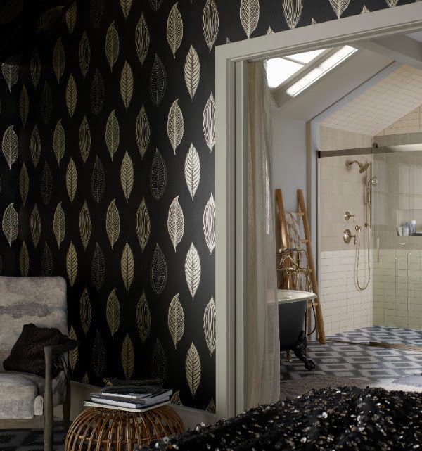
           The main thing is the reflection, making sure that it didn’t feel bogged down by the color and the texture. And, of course, a moody atmosphere is perfect for a powder room or a master bath. Here in this Victorian-inspired bathroom, smoky grays and dusty browns are paired with a metallic wallcovering and warm bronze light fixtures, giving a glow that radiates through an already welcoming room.
Classic dark color scheme in bathroom for Noir decor.
Noir
Classic black is a perennial favorite in interior design. Once a staple in bathroom design, black has made its way back into this private space and is making its presence felt in the kitchen more frequently, too, especially with the recent debut of black stainless steel appliances. 
But it’s the emphatic pairing of black and white that is the real showstopper of late. Think high contrast: strong color-blocking, big heavy stripes and even more unexpected patterns. In this master bath, bold chevron floor tiles offset the glossy white tub with a matte black exterior. Highlights of bronze, brass, or copper work particularly well layered into the overall design—here bronze adds a touch of warmth to this dynamic space.
White and black styled bathroom. Clean and simple decor from Kohler.
           In this striking black-and-white kitchen, a wash of bright white counters cover the island and punctuate the grand room sheathed in black cabinets. If you’re an eclectic person, having your kitchen be a solid black and white is important because you may have bright colors that you want to incorporate. The space combines timeless quality with a perfect modern mix.
A natural color palette mixed with plants make this room feel open and classic.
  

Advertisement


Michiel Perry

Advertisement

More Posts

0

Comments

comments

Advertisement
Follow:
Michiel Perry

Leave a Reply

Your email address will not be published. Required fields are marked *

Some of the links in this post are affiliate links. This means if you click on the link and purchase the item, I will receive an affiliate commission at no extra cost to you. All opinions remain my own.

Shares