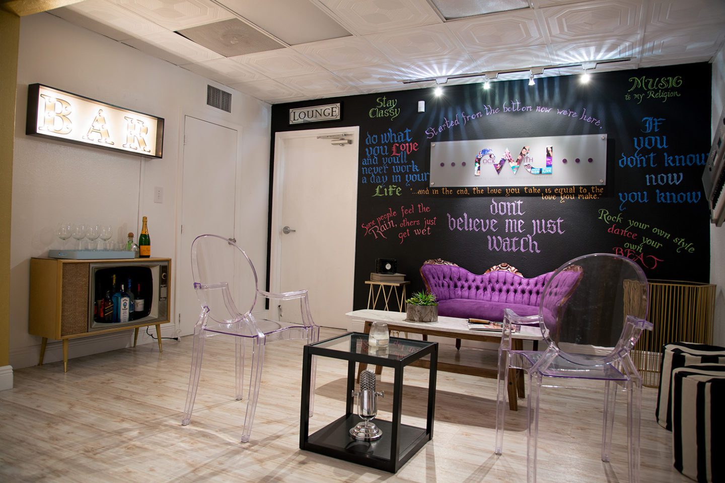
This commercial project is a fun play on southern with a modern twist and a little musical influence. Tonisha Ramona is the owner of Plush Interior Design and we are so happy to showcase her commercial project and hopefully you can get some inspiration for your home or business as well.

Name:Tonisha Ramona
Title: Interior Designer
Organization: Plush Interior Design
Hometown: Brooklyn NY
Current City: Jet-Setting between NY & Miami
Website: www.byplush.net
Space Name: Rock With U Entertainment
Space Location: Miami, FL
What do you love about southern decor? Southern decor has a charm wrapped in warmth, history & agriculture. The warm in south is directly growth and a fresh way of living. The fact that there is no fall/winter where everything dies leaves a lovely element of life which lasts all year round. It almost leaves you endless possibilities as a designer whether you are doing outdoor or interior decor. Southern decor allows you to take the inside out and bring the outside in.
What is your favorite room for a commercial client? It truly depends on the business.I love the shopping area of a boutique, but I also really enjoy doing bathrooms. I have such a phobia of public bathrooms in my personal life, I take a lot of pride in ensuring commercial bathrooms don’t feel like public bathrooms. But I also REALLY love a window display! The challenge of capturing a brand + their products + display theme to = customer attraction literally keeps me up at night with excitement.
How did you start brainstorming for this project? With this project I started to collect notes regarding the company’s’ clientele, their plan for the future of their biz as well as the client experience they wanted to achieve. So I started with those functional essentials as well working with the actual space. Being that the space is a 10k warehouse/loft which only has about 2 windows I knew the use of color and layout would be important to not make the space feel dark, claustrophobic and stifling. I then started thinking about the fun quirky accent pieces which were “Must Haves” on my design list. i also pulled colors from their logo to assist in creating a cohesive color palette. Once we we solidified the color palette I then started to decide on color placements and layouts and that’s the over simplified short story of the creative concept which turns into a large snowball of artistic awesomeness.
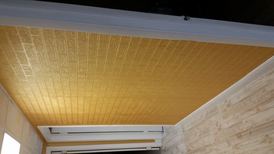
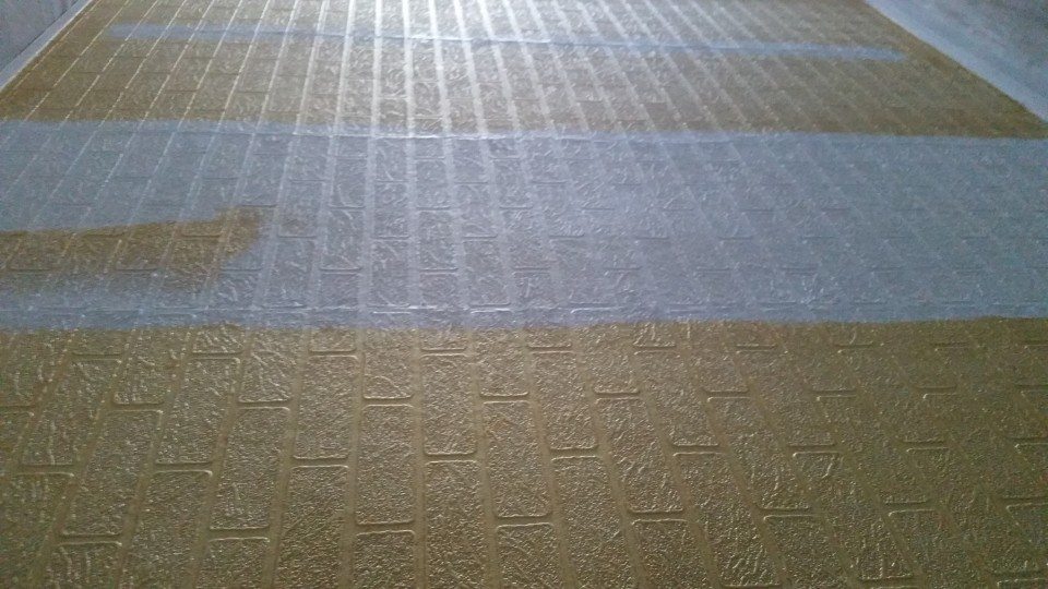
BEFORE


What southern brands did you source from for this project? What do you love about them? I didn’t use any southern specific brands but I used local contractors, labor and even purchased a few vintage pieces from some antique shops located in the south. {Georgia, Lousiana, etc.}
What type of music did you listen to help you design this project?Great question. During the initial conceptualizing process I was listening to a combination of Shakira, Sia & Bob Marley. During the installation process it was probably 75% Amy Winehouse & 25% Lauryn Hill
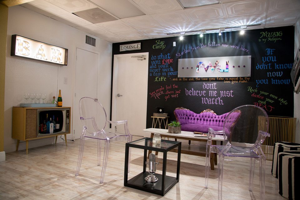
What were some must haves for this client? Immediately I knew I was going to use vintage pieces with character which can help tell a story for the space when mixed with the more modern pieces such as the vintage television and the Queen Anne style setee.

How would you describe the style of this space? That’s a hard question. As a designer I’m not really into labeling a style of a room with one word. I think it’s like giving a woman defining her style in one word it’s almost impossible particularly if the woman’s style of fashion is interesting. A woman/person is comprised of multiple facets & layers therefore making almost devalued to attempt to box the style into one name. The style of the space is a combination of natural textures, rustic minimalism, vintage elements, modern flare and a slight touch of glam and pizzazz.
What inspires you about interior design in Florida? The two most popular styles of architectures in South Florida is Mediterranean & in Miami specifically the Art Deco style of architecture is pretty awesome! I love to focus on the story of the neighborhoods which reflect each style. The development of South Florida is pretty young, it went from being the “Traditional South” to this awesome melting pot with a Caribbean essence in about 50 years. It’s almost like each decade told a very different story which rolled into the next decade and so on and so on. Another one of my favorite aspects of South Florida design & architecture is how flowers, moss, grass, and a beautiful collection of botanicals are incorporated in the infrastructure & architecture of the neighborhoods. South Florida IS swamp land so it’s very green, wet & a perfect ecosystem which allows beautiful low maintenance botanicals.
What things do you like to have corporate clients think about when it comes to designing? It’s important for me to educate my clients on how their brand & biz culture should be represented throughout their commercial space. It’s important for clients to be able to experience the brand as soon as they walk into the company’s space and in some cases from the outside of the storefront. This is important because when investing in your commercial space it’s important for it to be done right, for it to serve as a type of advertisement for the company’s products & services as well as their brand and image. When making such an investment you gotta go big or… you know the rest.
What spaces are most important for a commercial design project? All spaces are important they simply have different purposes and important factors. The areas where clients will be spending money or making decisions about spending money should not only be comfortable & functional, but this area should have the highest concentration of the part of your brand you want your customers/buyers to connect with. The areas where your team will be working and pushing the company and brand forward should enhance their abilities to produce. A different attention to furniture layouts, colors & accessories should be applied to staff members offices & suites.
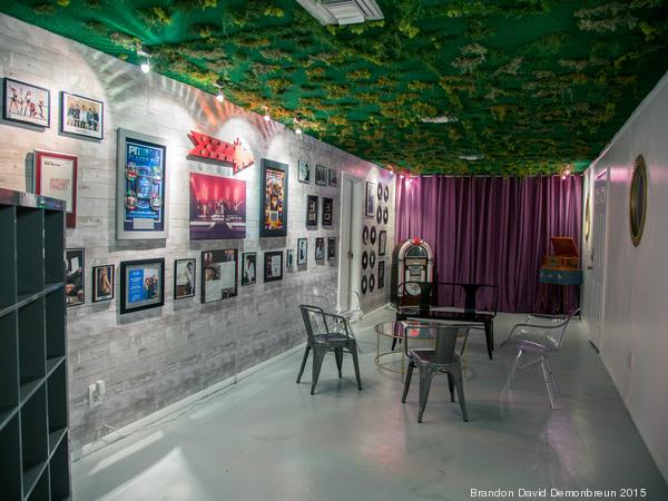
What design elements of Miami did you incorporate into this space? I incorporated a lot of greenery, mid century inspired pieces and a combination of bright & muted colors within the color palette.
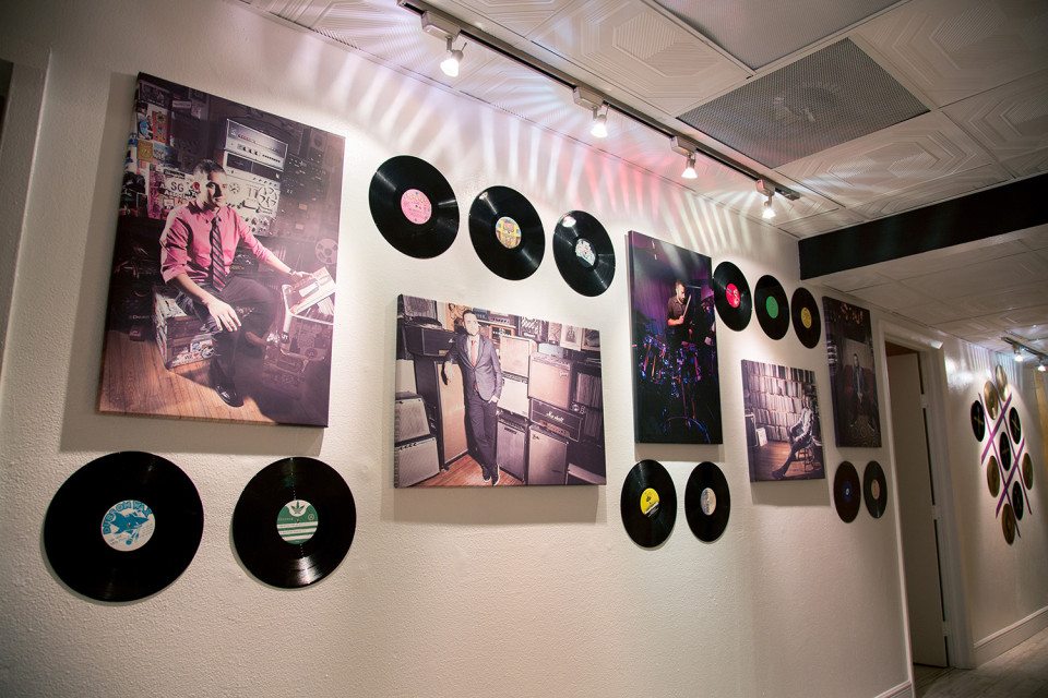
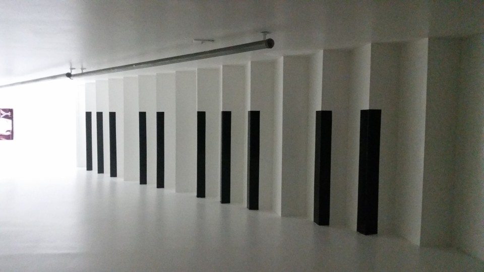
What elements of music did you include in this space? We used a lot of records in creative ways, an awesome jukebox in the Studio Hallway, a vintage style mock microphone in the lobby area, Warhol style Beatles framed artwork, colorful prints of Jay-Z, Toni Bennet & Michael Jackson. Oh! And I decided last minute to throw a keyboard on the wall. Why not right?
How can we connect with you? How can you NOT connect with me right? You can learn more about what I do & see my work on my website. My blog is where you can get daily or weekly doses of my projects and creative decor insight for you knowledge. You can find my social media links on either Blog or Website.
Website: http://www.byplush.net/
Blog: http://tonisharamona.blogspot.ca/
FULL GALLERY
